Challenge
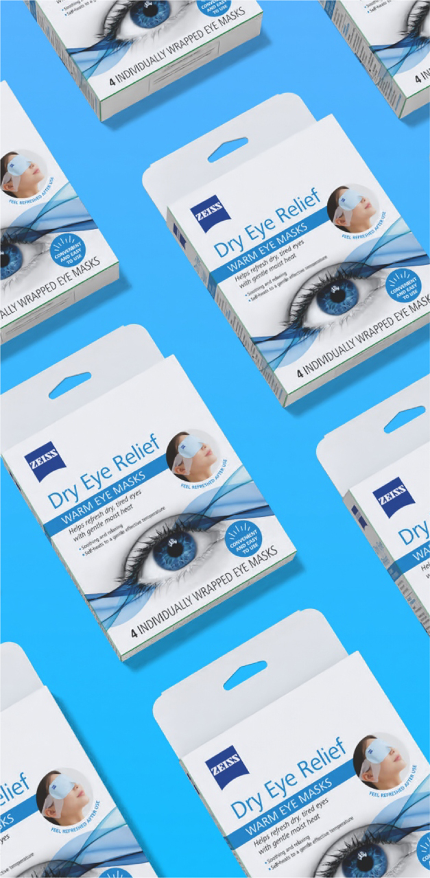
ZEISS was launching its warm eye mask in the USA and some selected European regions and they tasked us with creating packaging that embodies the brand’s core values: trust, technical expertise and product excellence. At the same time, it needed to clearly convey the product’s key consumer benefit: refreshing relief for dry eyes. This is particularly important in the US market, where this category is still relatively new.
Solution
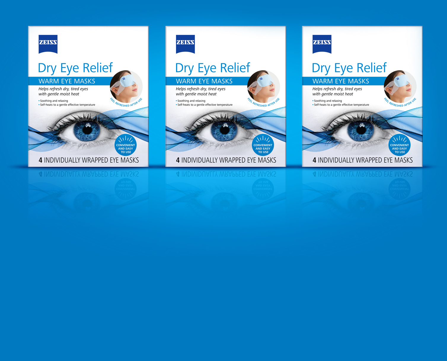
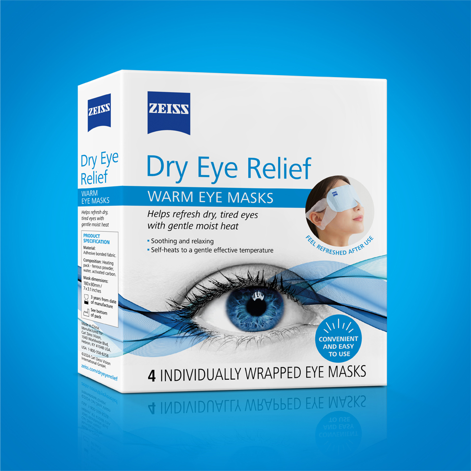
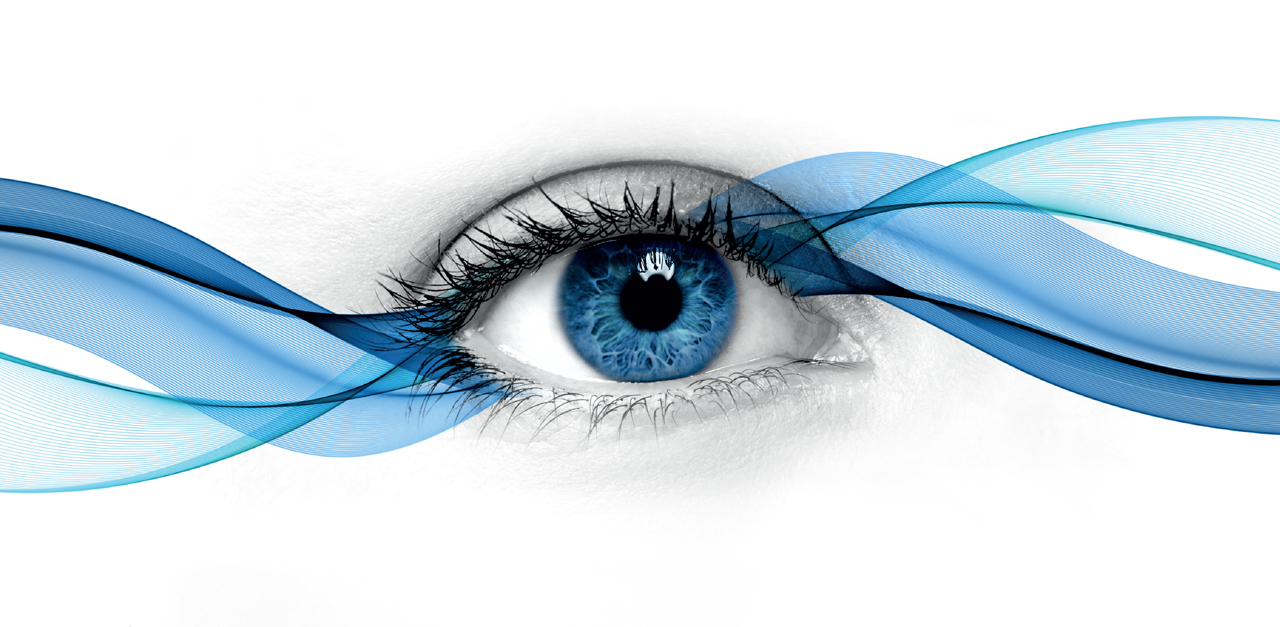
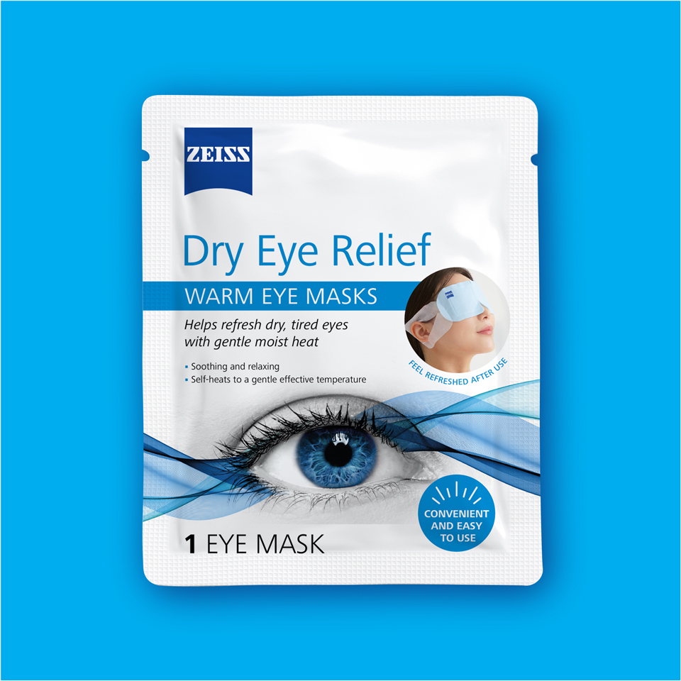
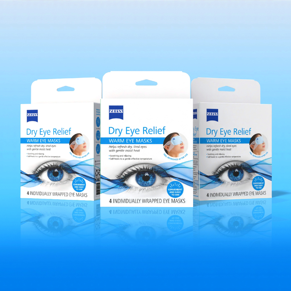
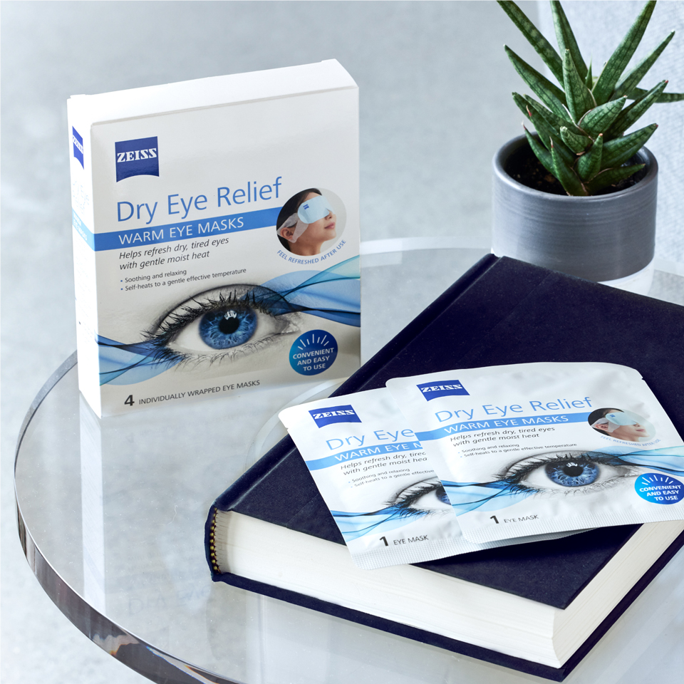
The final design is clean, confident and unmistakably ZEISS. A crisp white backdrop and modern typography reflect the brand’s precision and heritage while standing out powerfully against the clutter of the crowded retail shelves. The eye-and-wave graphic, created in the brand’s signature colours, evokes the mask’s restorative qualities and the overall benefit of bright, healthy, beautiful eyes.
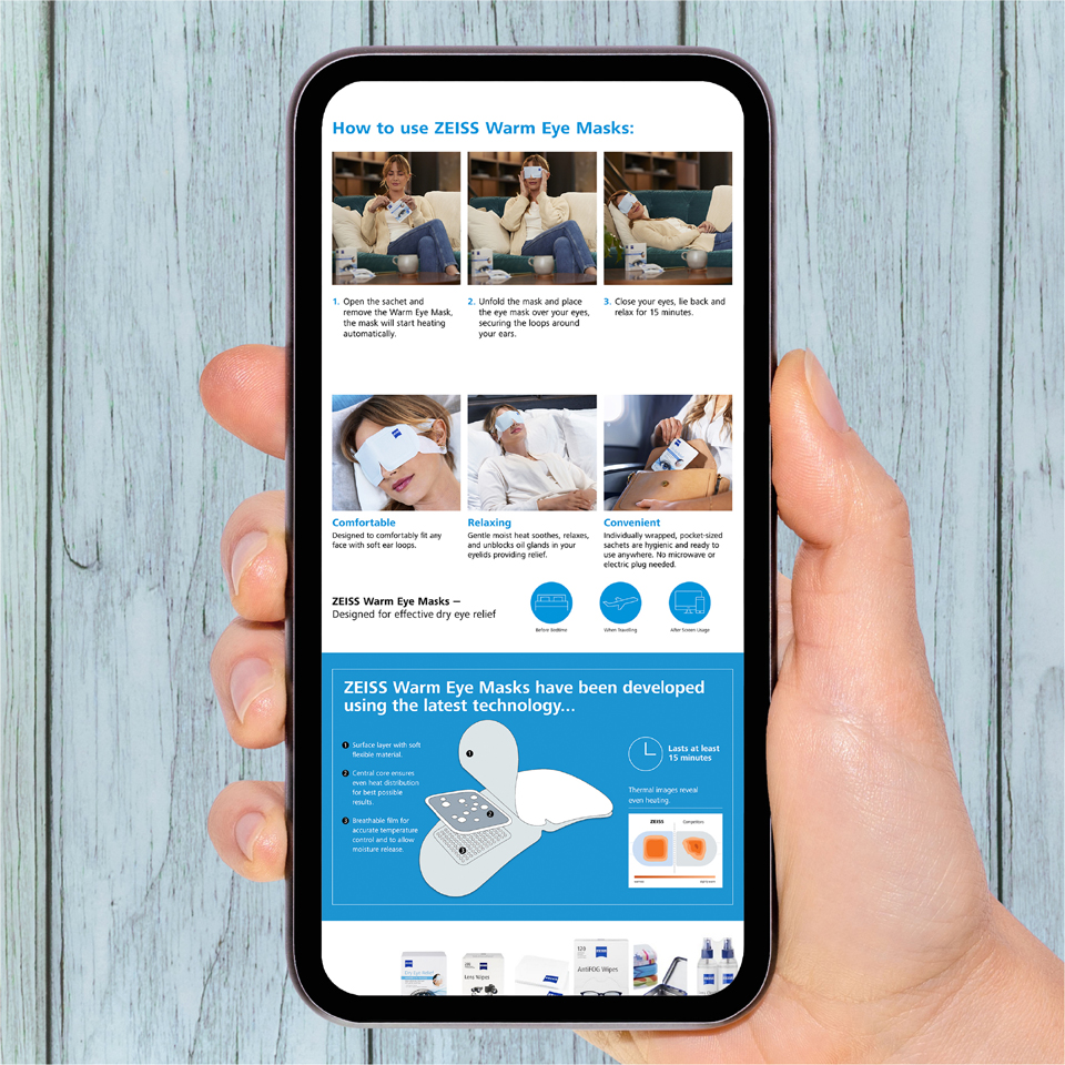
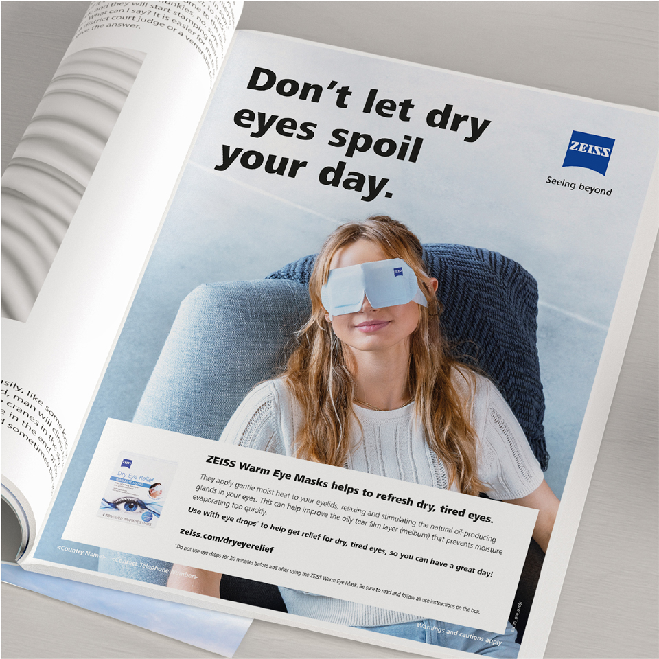
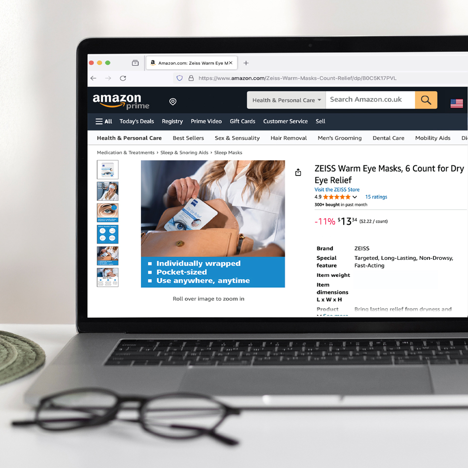
Beyond the pack itself, we developed a suite of communication materials, including a series of key visuals for use across consumer touchpoints such as online platforms, pharmacies and optician stores. The result is a consistent, cohesive activation programme successfully implemented in the USA and adapted for markets across Europe.
