Challenge
After successfully helping Toolstation launch seven retailer brands, we were thrilled to be asked to create the name, identity and packaging for their first power tool range.
The challenge was to build a brand that felt tough, reliable and professional to appeal to tradesmen while still connecting with DIY users. It needed to instantly communicate performance and durability – key qualities in such a competitive category.
Solution
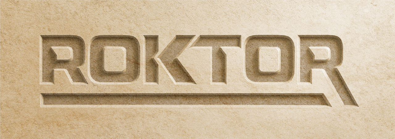
Following an intensive naming process, ROKTOR stood out as the perfect choice, resonating strongly with both internal stakeholders and the target audiences. The name conveyed strength and endurance, aligning perfectly with the Toolstations brand’s promise.
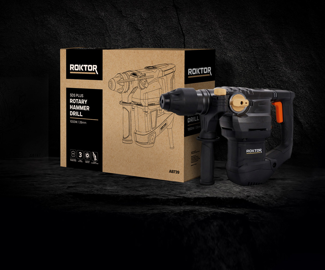
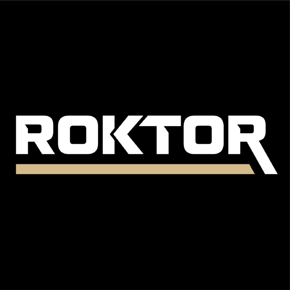
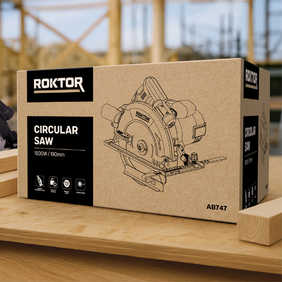
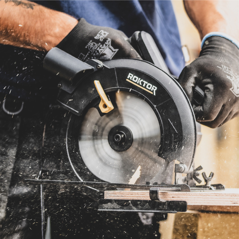
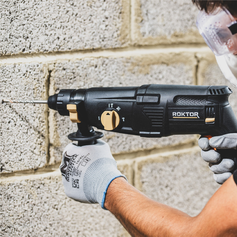
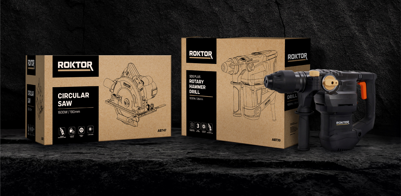
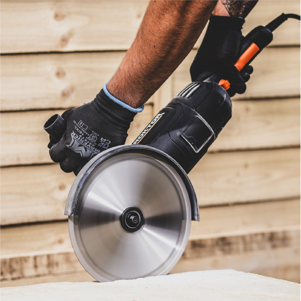
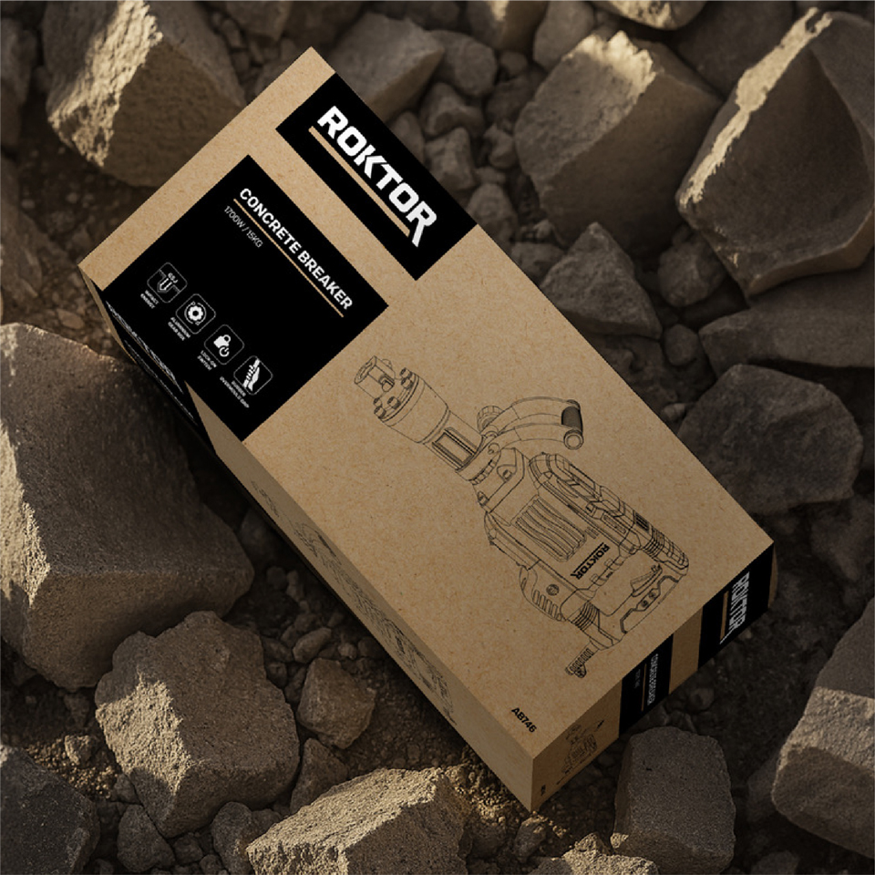
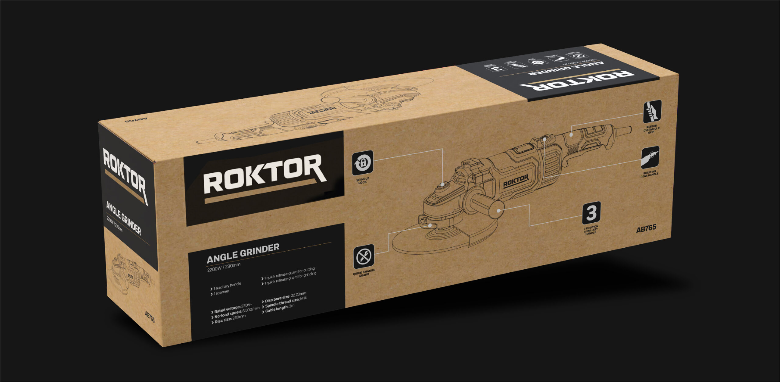
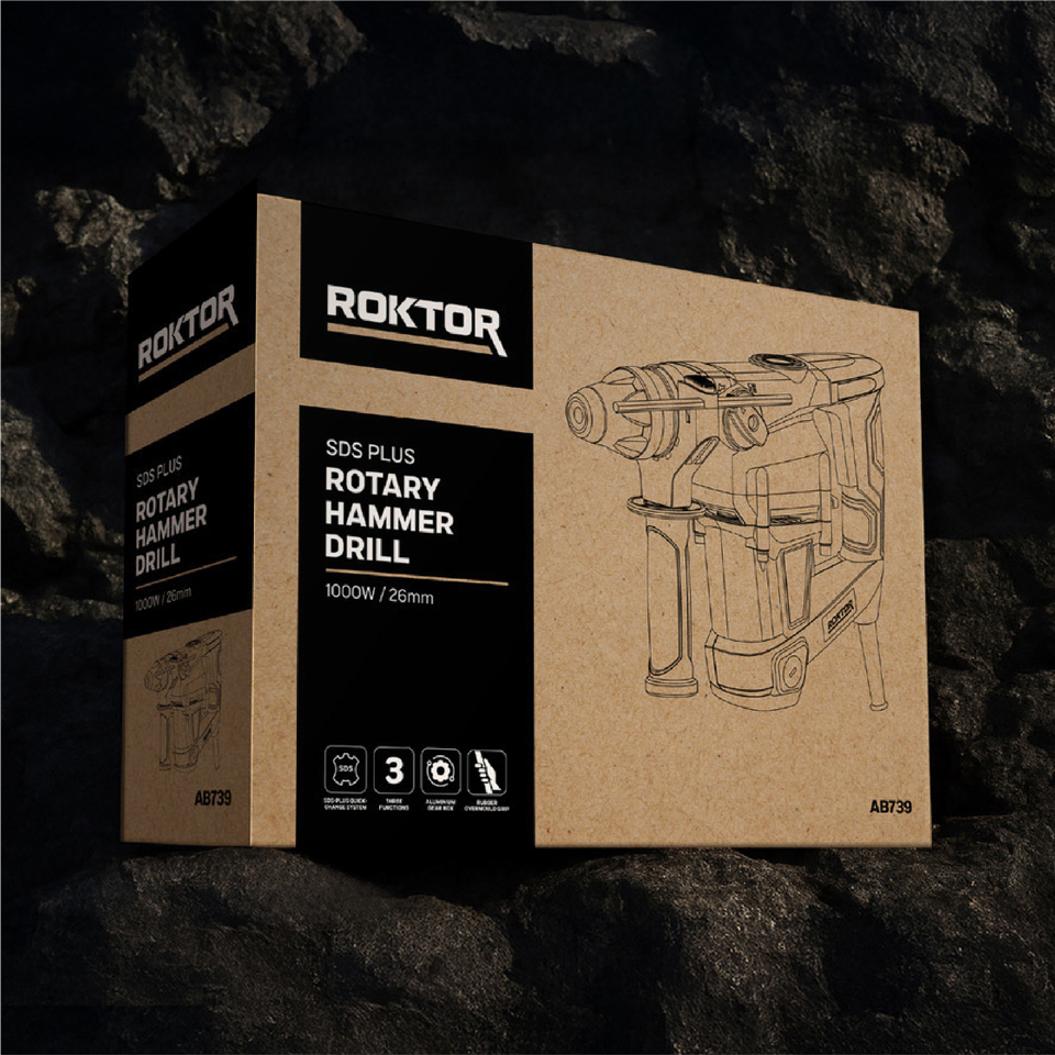
We crafted a bold, uppercase logotype with clean, masculine lines and paired it with a sand and black palette inspired by rugged landscapes. The design carried seamlessly into the packaging, which balanced impact with sustainability using recycled board and a two-ink print system to minimise environmental impact.
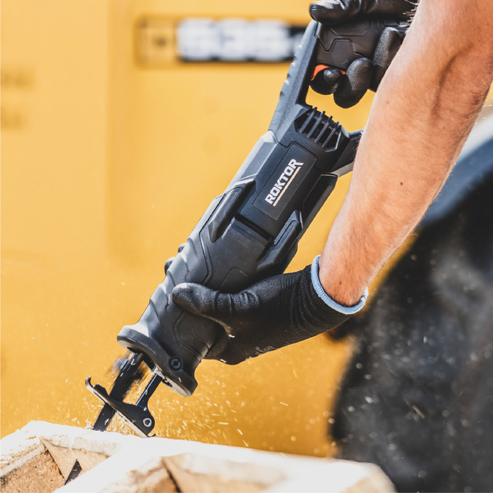
The launch delivered a striking new brand that commands attention, inspires trust and reflects the dependable performance of the tools themselves.
