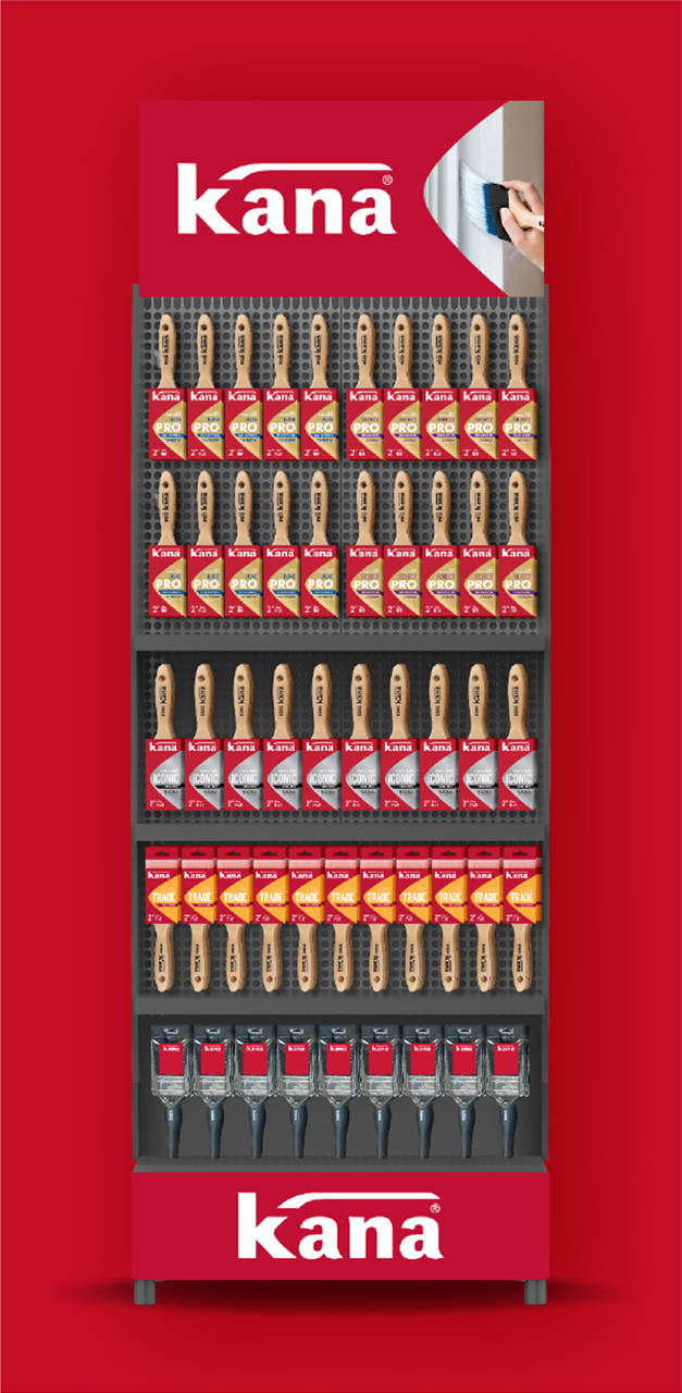
Challenge
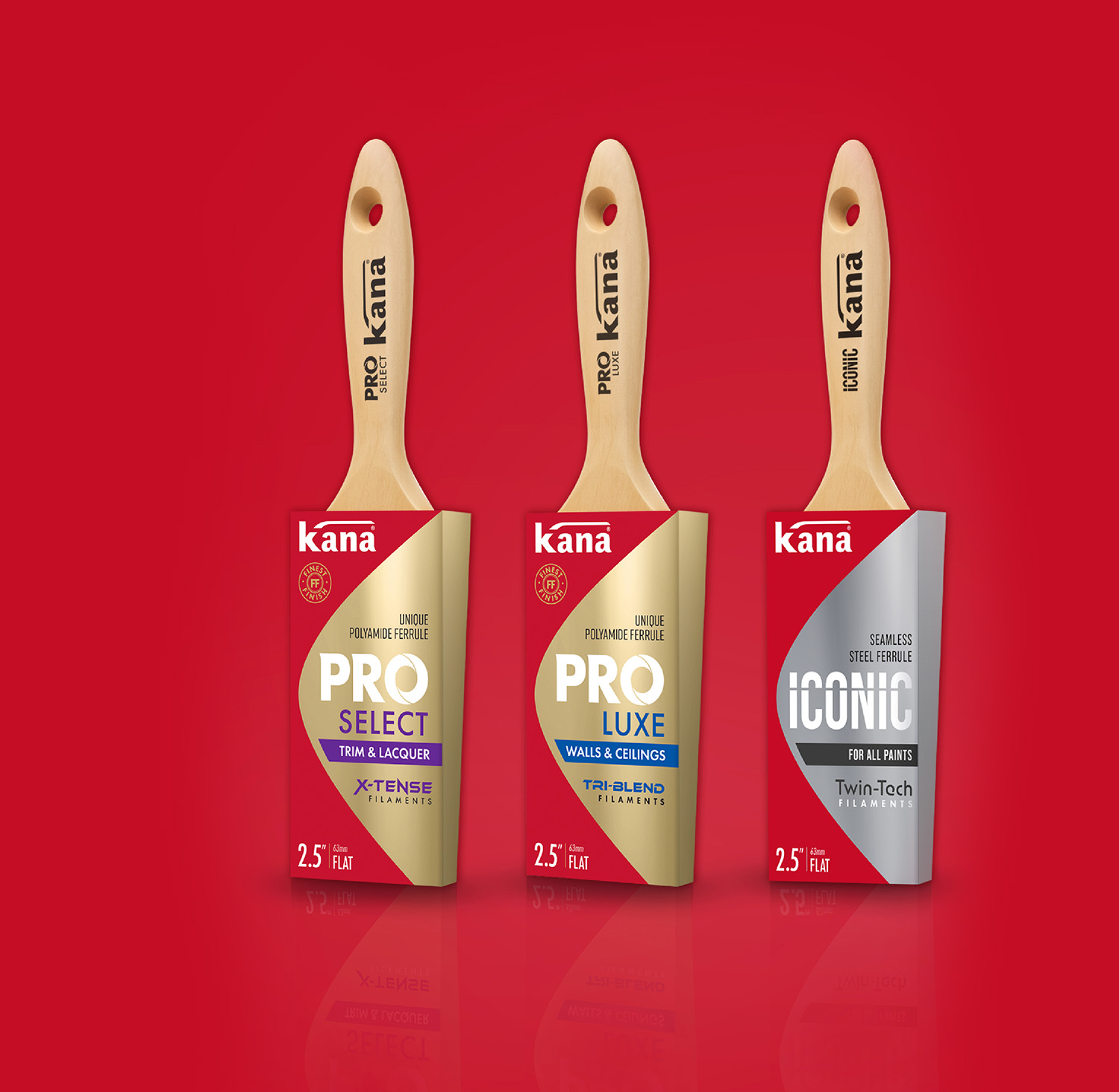
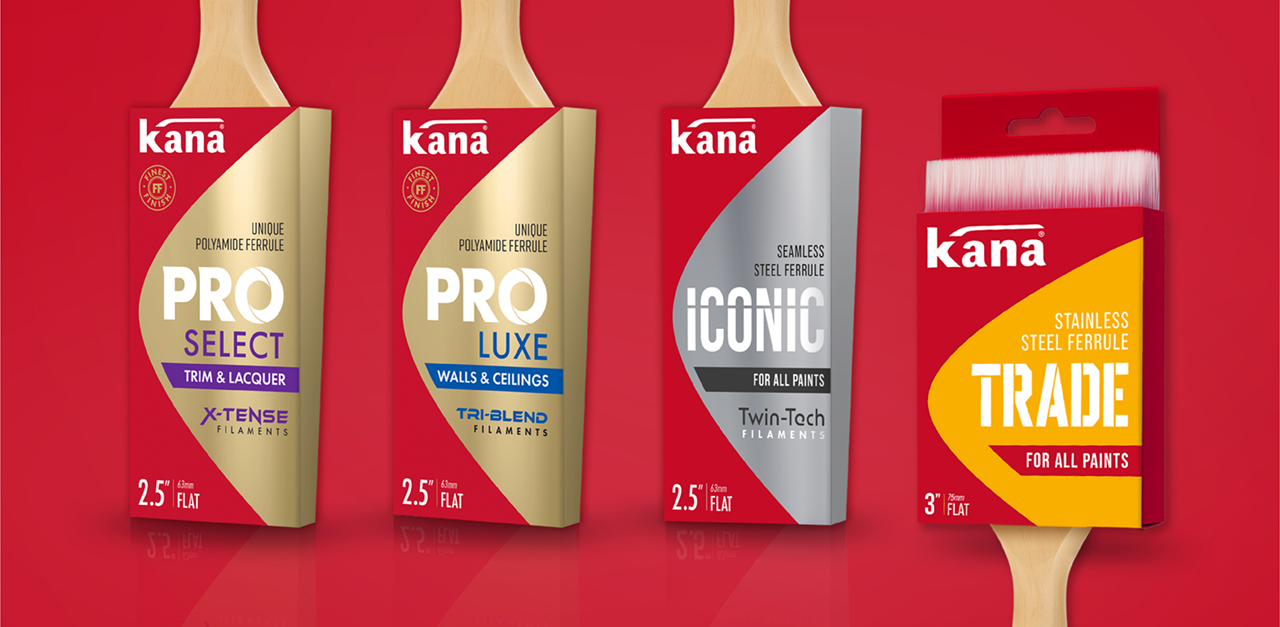
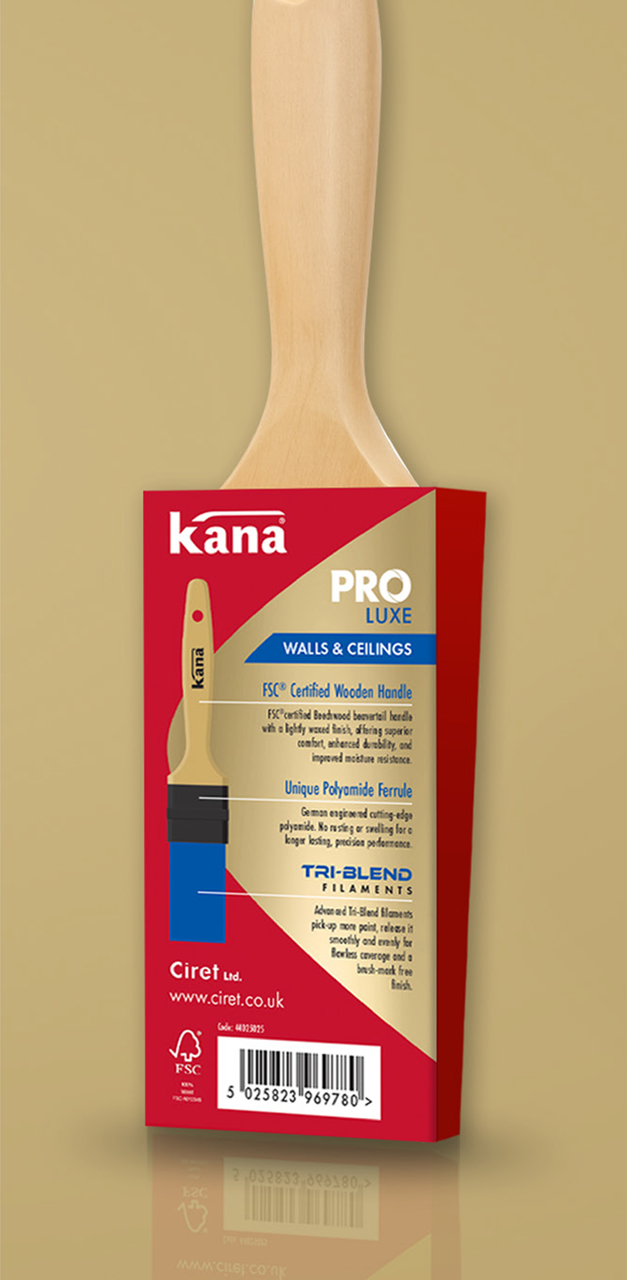
The Kana brush range was looking dated, undifferentiated with key benefits and performance hierarchy poorly communicated. Although these premium brushes offered clear competitive advantages, the packaging failed to convey this effectively. Our brief was to introduce premium cues, improve shelf presence and position Kana as a high-quality brush range.
Solution
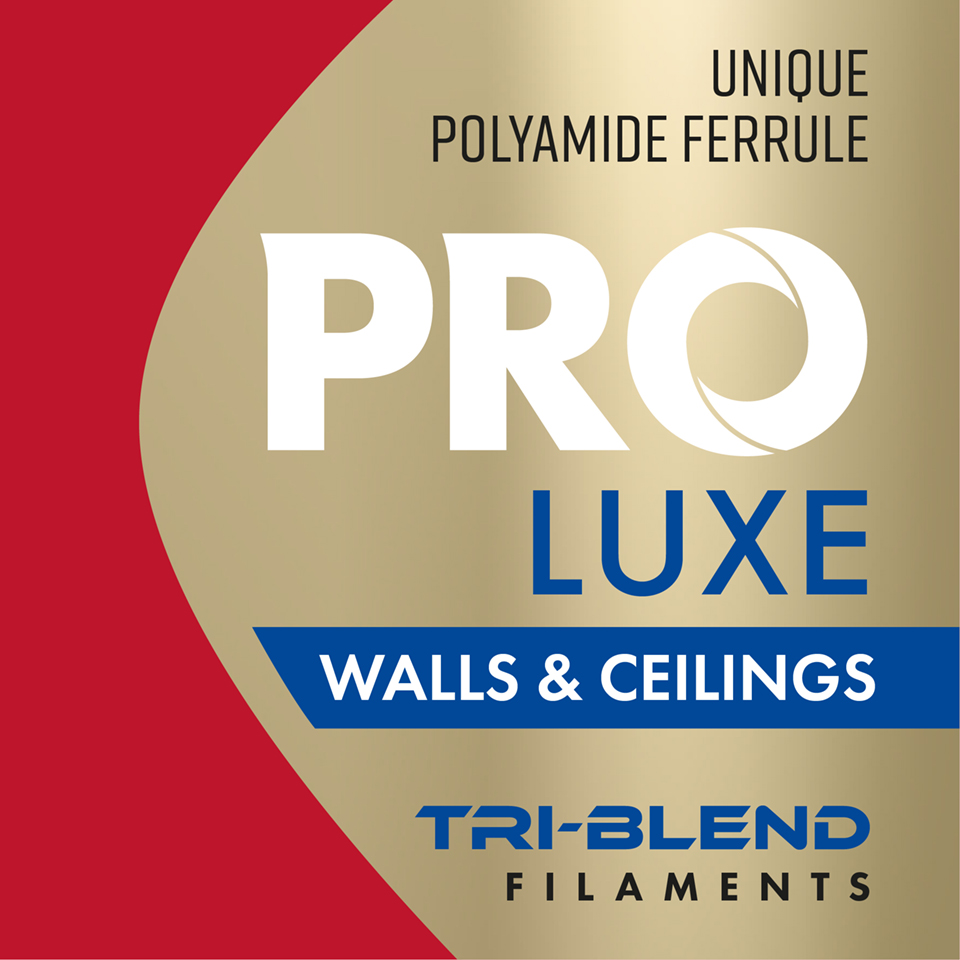
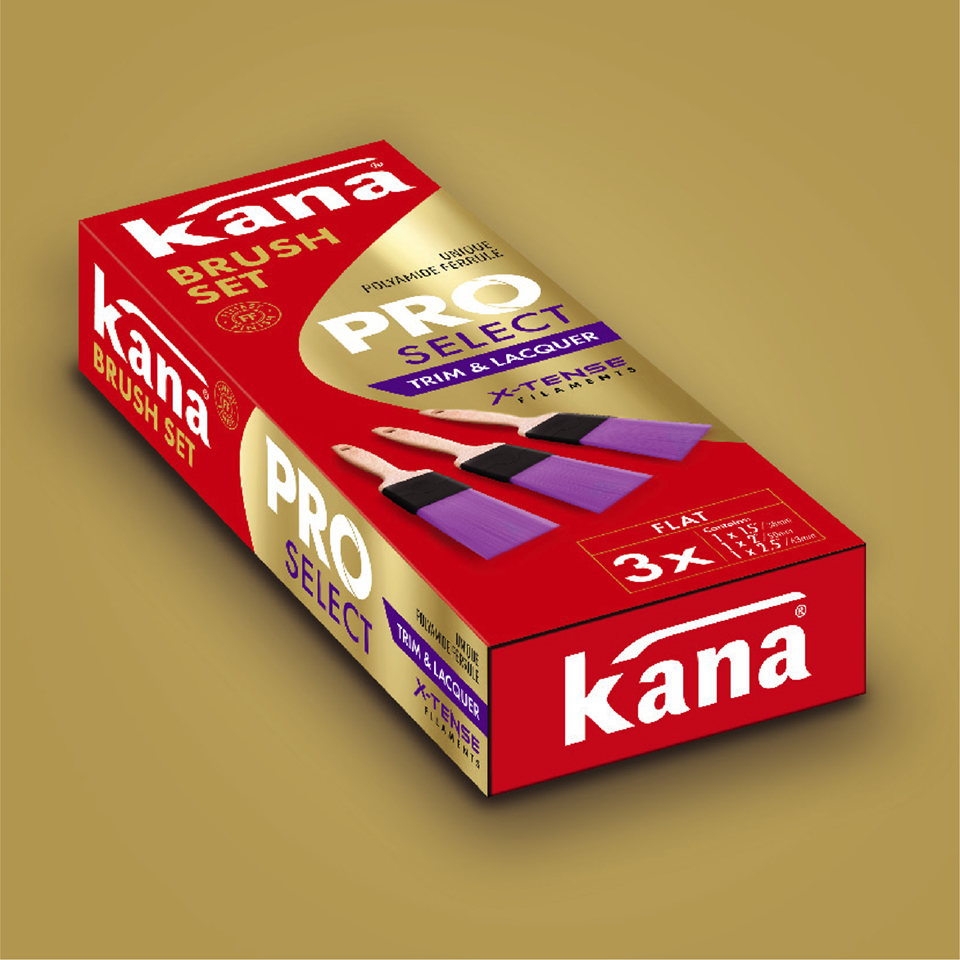
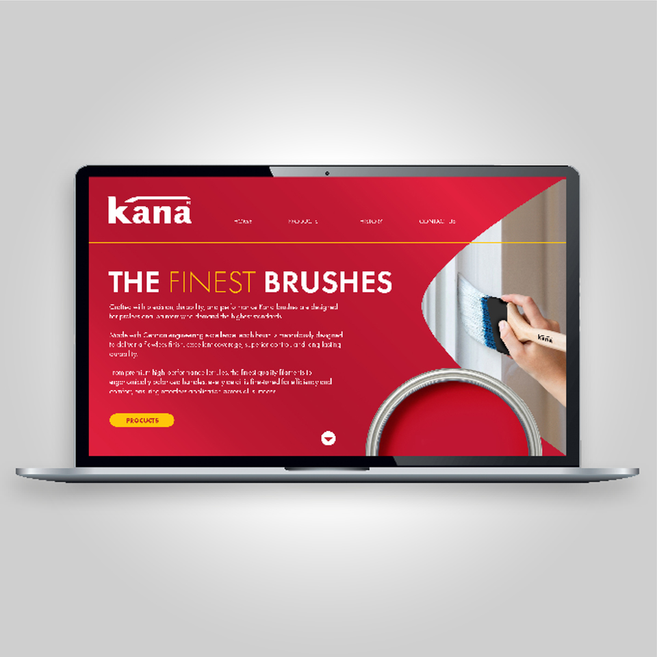
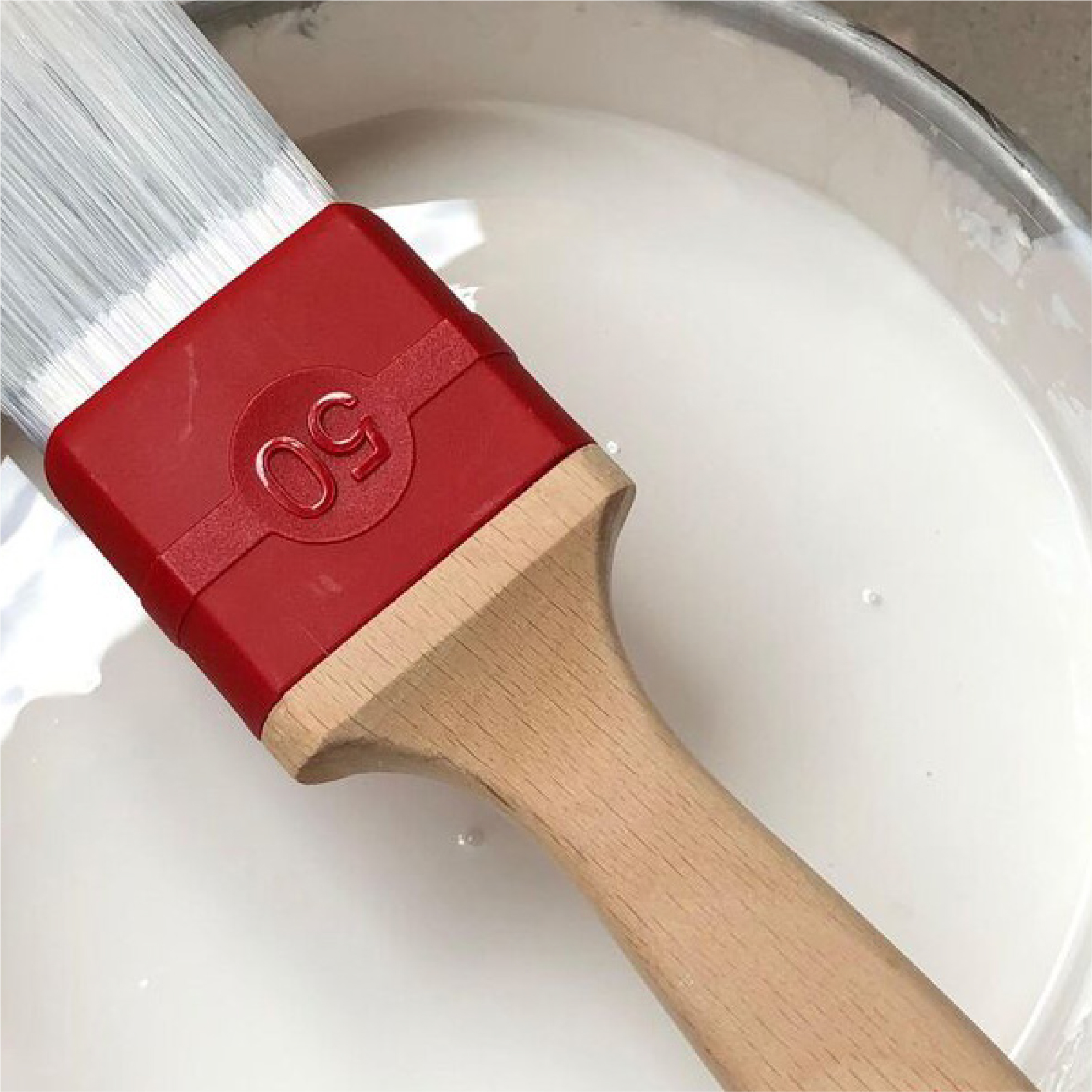
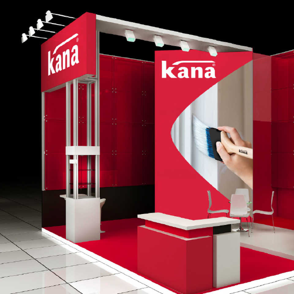
Our new packaging design introduces a bold and contemporary evolution of the brand. The Kana red, a defining brand colour is used to create strong impact on shelf enhancing the brand’s confident personality. Inspired by the distinctive curve in the K of the Kana logo, the dynamic new holding shape becomes a powerful visual element that gives instant recognition for the entire range across all touchpoints. Metallic colours reinforce the quality and expertise resulting in a sophisticated, modern and instantly recognisable packaging that elevates the Kana brand.

