Challenge
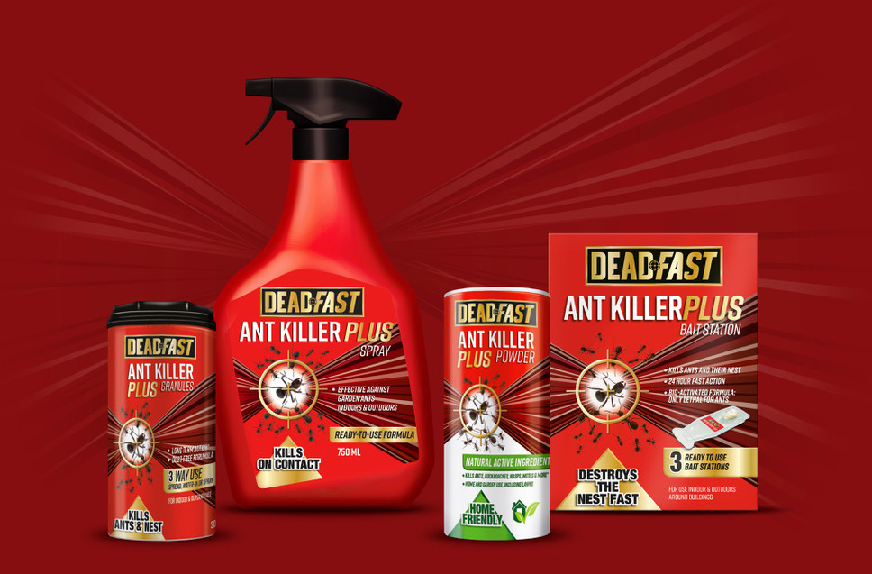
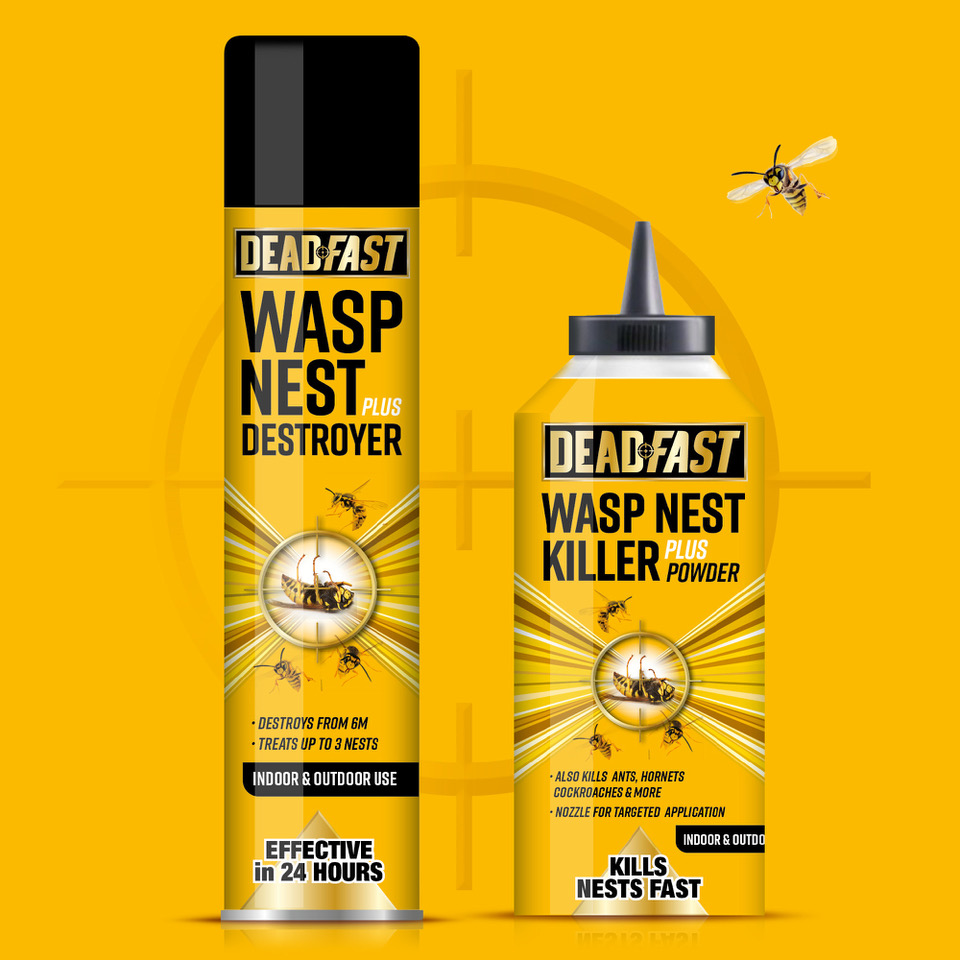
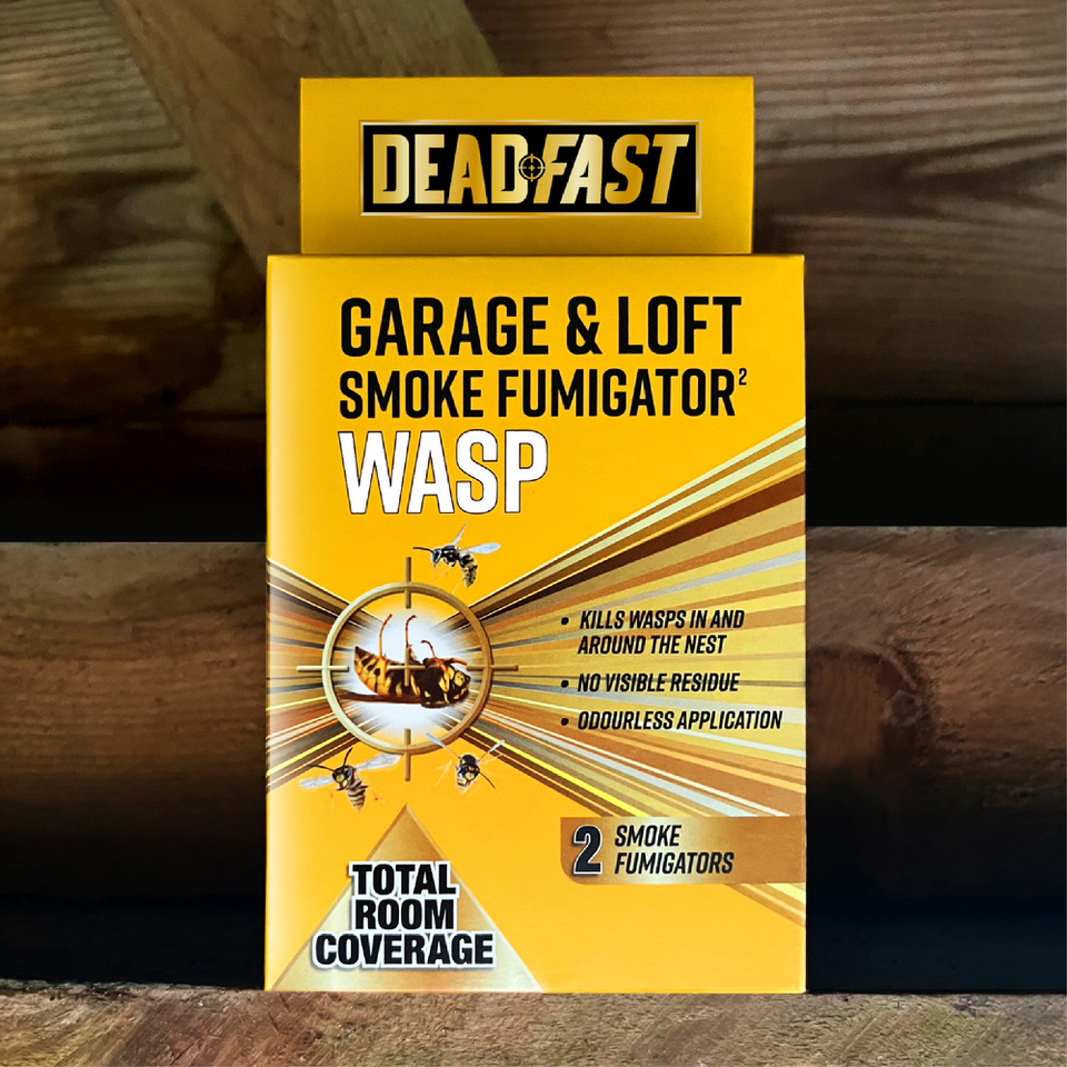
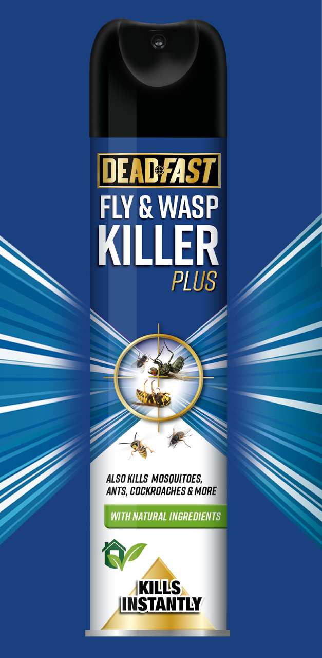
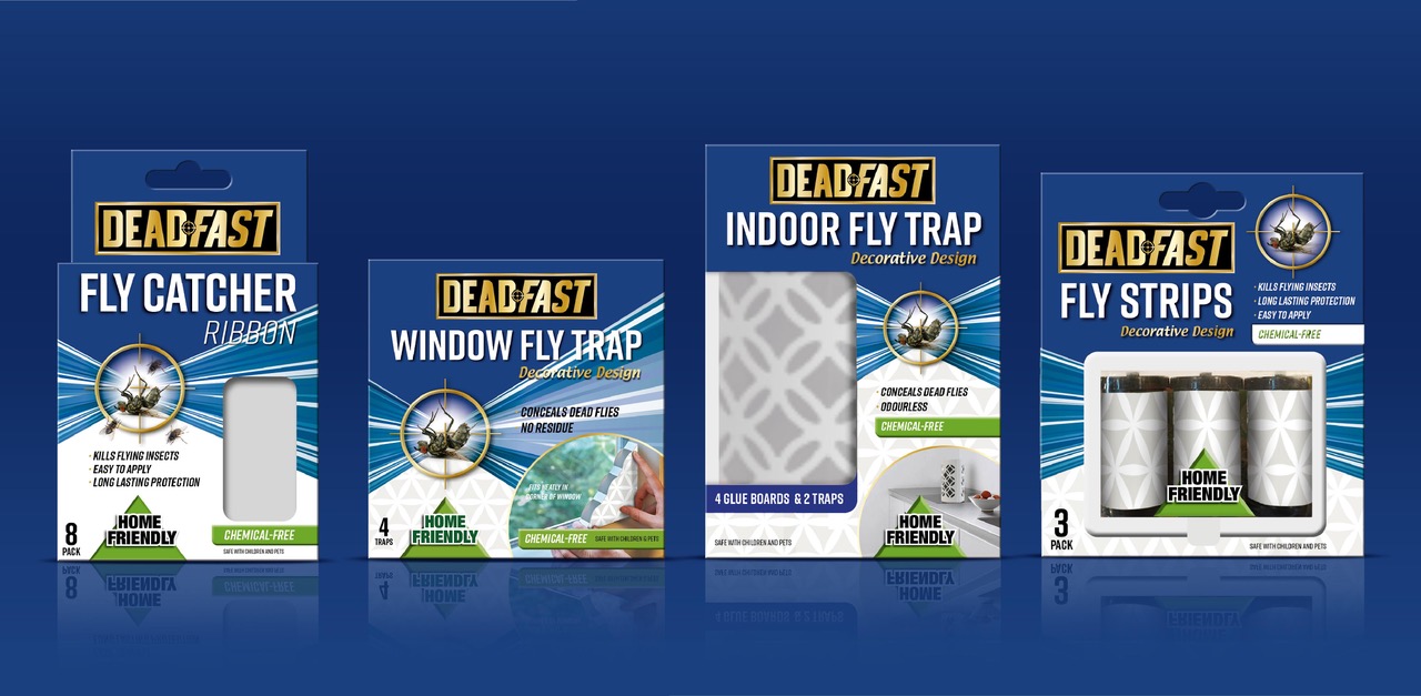
Following the successful redesign of Deadfast’s core range, the team at Design Group International were tasked with creating packaging for the new wasp, ant and fly control products.
Our goal was to create a bold, cohesive range that grabs attention, especially in the poorly lit, back-of-store aisles. As these products tend to be infrequent distress purchases, we also had to ensure they were easy and intuitive to shop.
Solution
Using strong colour coding and the signature Deadfast target and flare assets, we created a cohesive look and feel that’s instantly recognisable, easy to navigate and clearly communicates product efficacy and benefits. This is crucial for distress purchases where consumer trust and confidence are key to driving purchase. Our new packaging has successfully driven increased sales and distribution paving the way for further range extensions.
