One of our favourite trends… Flat Illustration
In the fast moving world of design trends, there’s one that stands out in terms of longevity and classic simplicity – Flat iIlustration style. Although its routes go back to the 1920s (with the creation of Swiss Style or also known as International Typographic Style), this illustration style has a crispness and cleaness that never fails to look confident, contemporary and strong.
Flat design is a minimalistic design approach achieved by stripping away 3 dimensional and other effects – these ornamental elements are seen as unnecessary clutter! Flat design has clean, open space, crisp edges, bright colours and two-dimensional illustrations giving it a graphic look.
But… just because there’s no flashy design effects doesn’t mean flat illustration is boring! The bright, contrasting colours make illustrations and text pop from backgrounds, easily grabbing the shoppers attention and guiding the eye. This is why flat design is always so popular.
In recent years, flat design has been used effectively to give wholesome, artisan cues. The authenticity of this design style lends itself perfectly to small batch, handmade products communicating provenance and quality. Coupled with bold, greyed-off colours and rustic handcrafted fonts they make a strong, impactful and appealing statement on shelf.
Spotted at the Spring fair…
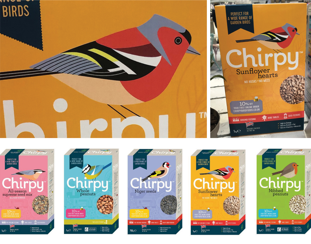
On our visit to the Sping Fair the other week we spotted the newly launched Chirpy packaging. Flat illustrations and bold colours are used with great effect by this a challenger brand in the birdseed market. This style creates huge standout on shelf and is also used to create a colourful, engaging website.

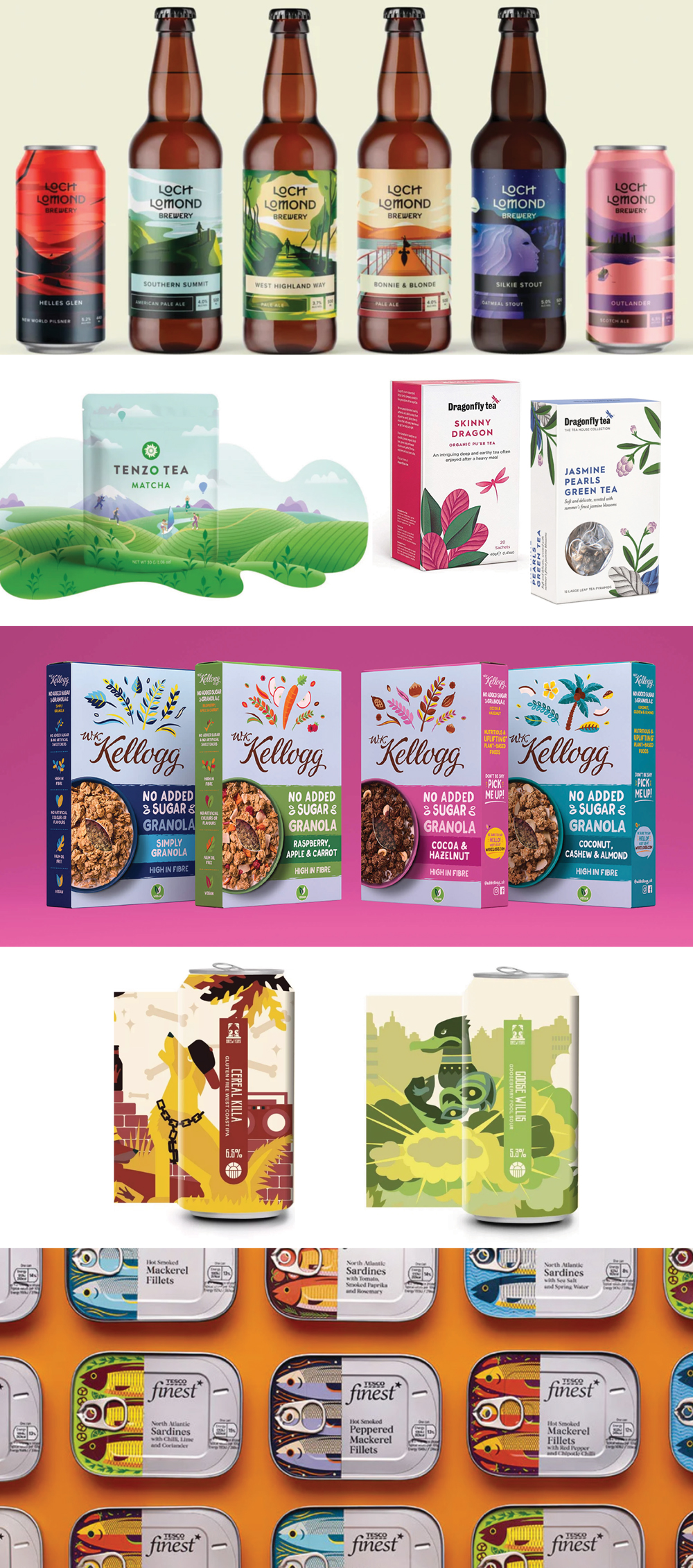
A few other flat illustration pack examples by various design agencies…

