Challenge
The Isopon brand already enjoys a loyal following among car enthusiasts, but our challenge was to make it more accessible and relevant to a broader consumer base. Our key objective was to guide and empower first-time users, helping them feel confident in tackling their own repairs.
Solution
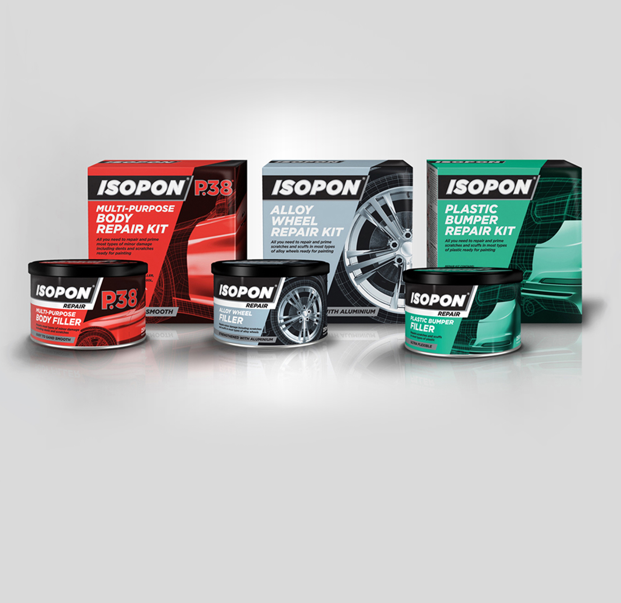
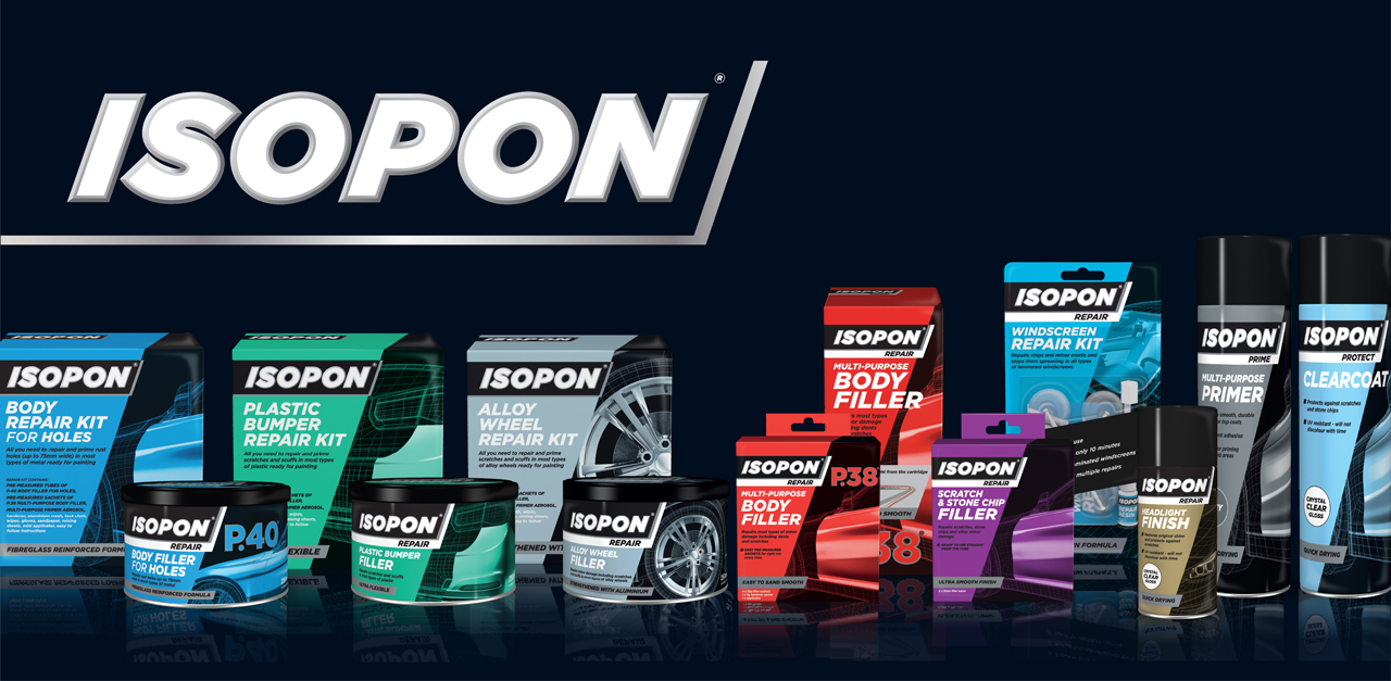
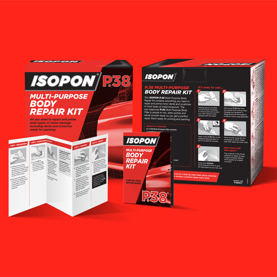
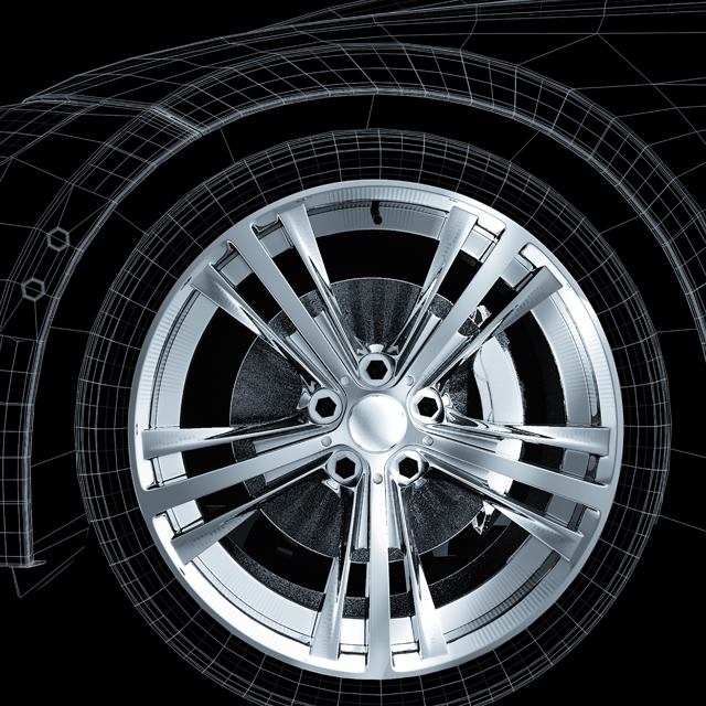
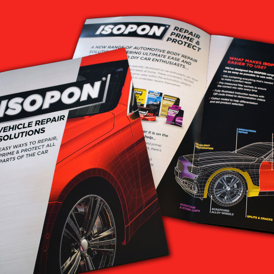
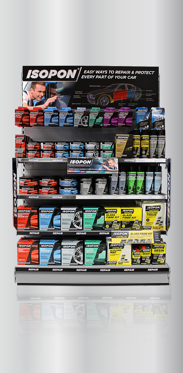
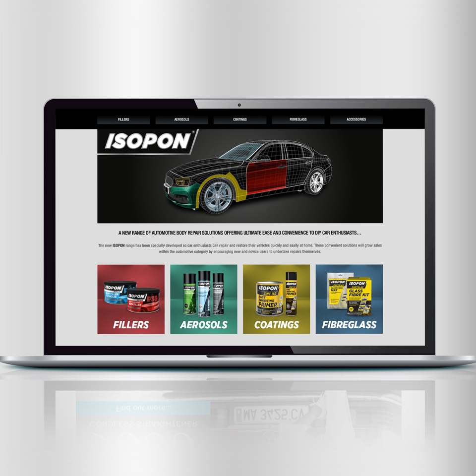
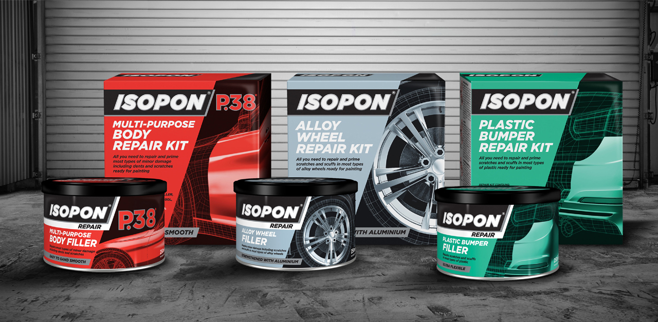
We achieved this by reorganising the range into a clear Repair, Prime and Protect system – making it easy for consumers to find the right product for their needs. The distinctive wireframe car illustration with bold colour coding segments the vehicle into the various repair areas. These colours are also reflected in the packaging to help consumers navigate the product range. This visual language also extends across the website and other communication touch points, transforming Isopon into a clear, trustworthy brand for all.

