Challenge
House of Fudge creates the most delicious handmade fudge crafted to a time-honoured recipe. But whilst the taste was delicious the branding and packaging weren’t quite as sweet! They wanted to engage a younger, more mainstream audience without alienating the loyal following of devoted fudge lovers. Our goal was to refresh and reposition the brand as a modern indulgence without losing the charm of the traditional recipe that has made it a favourite for decades.
Solution
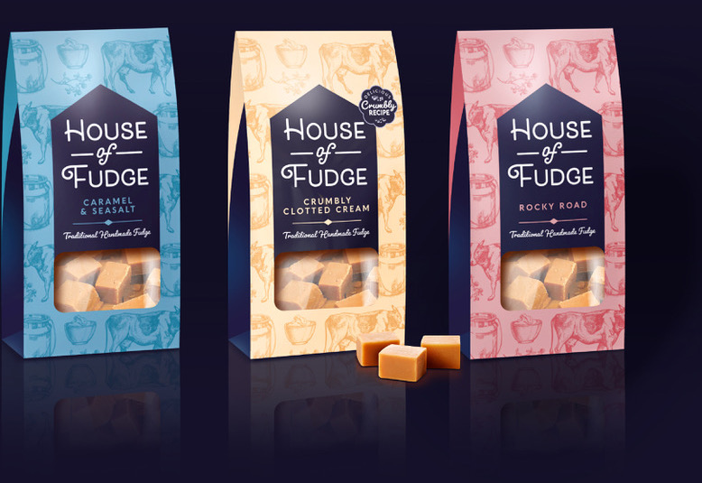
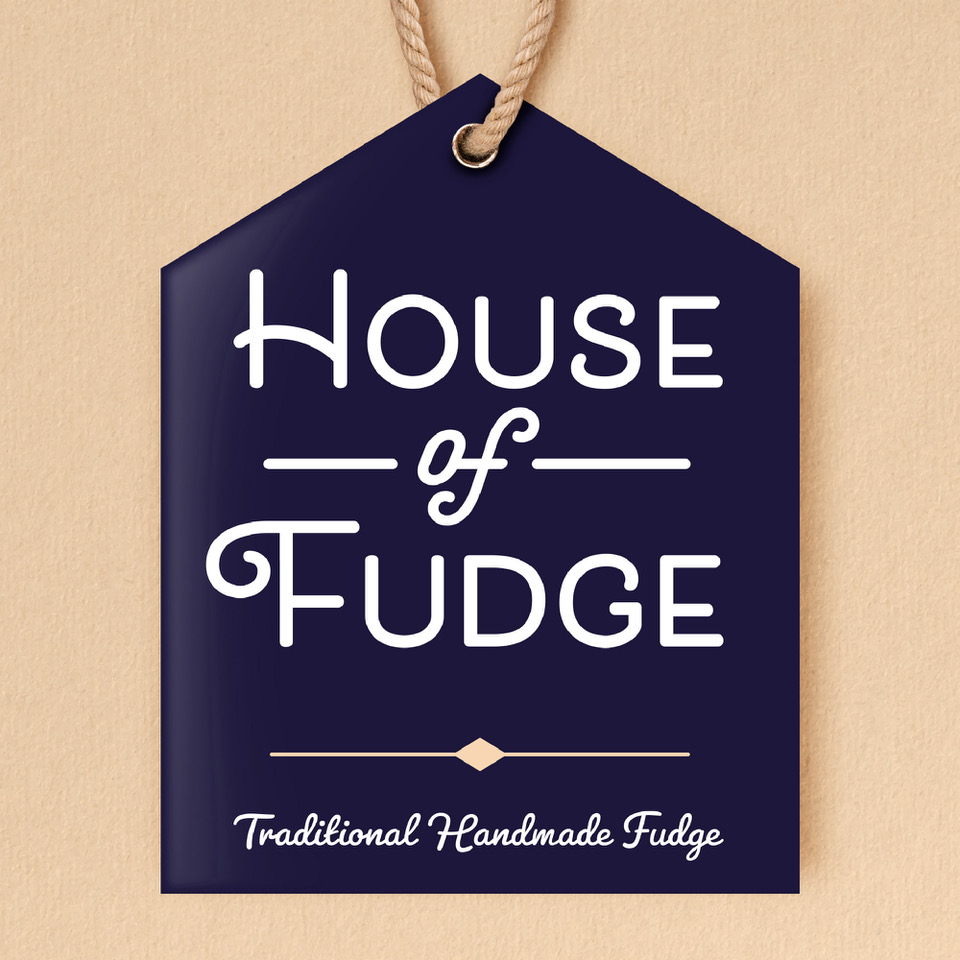
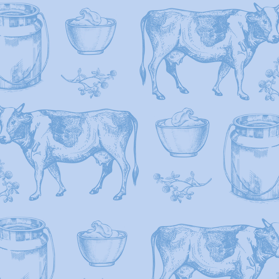
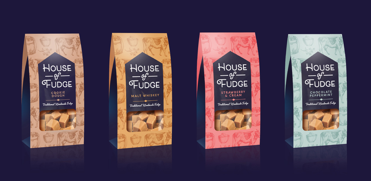
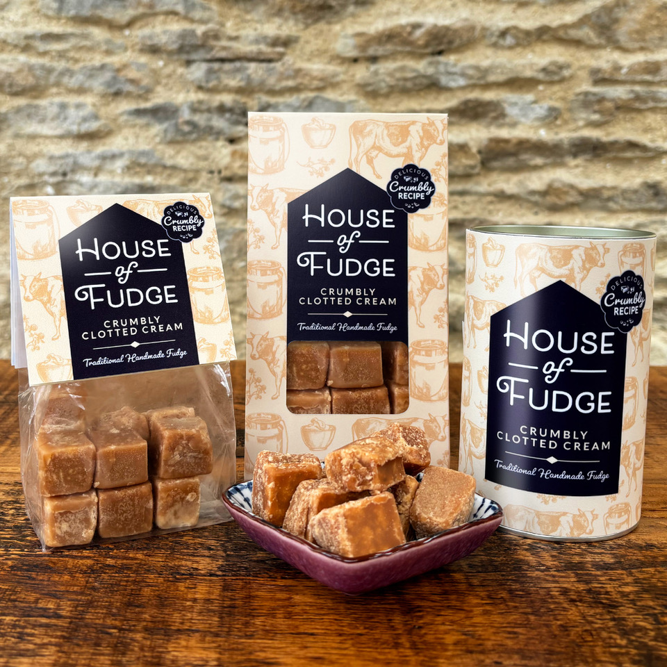
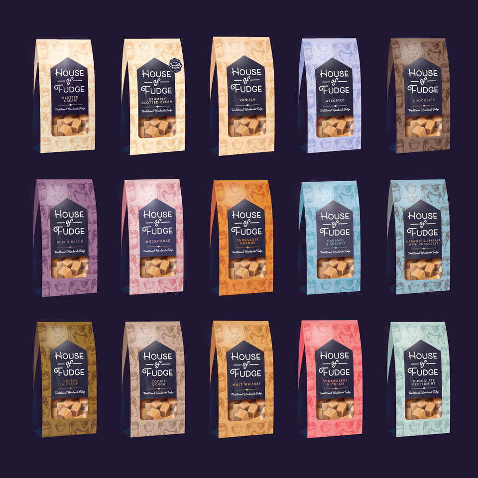
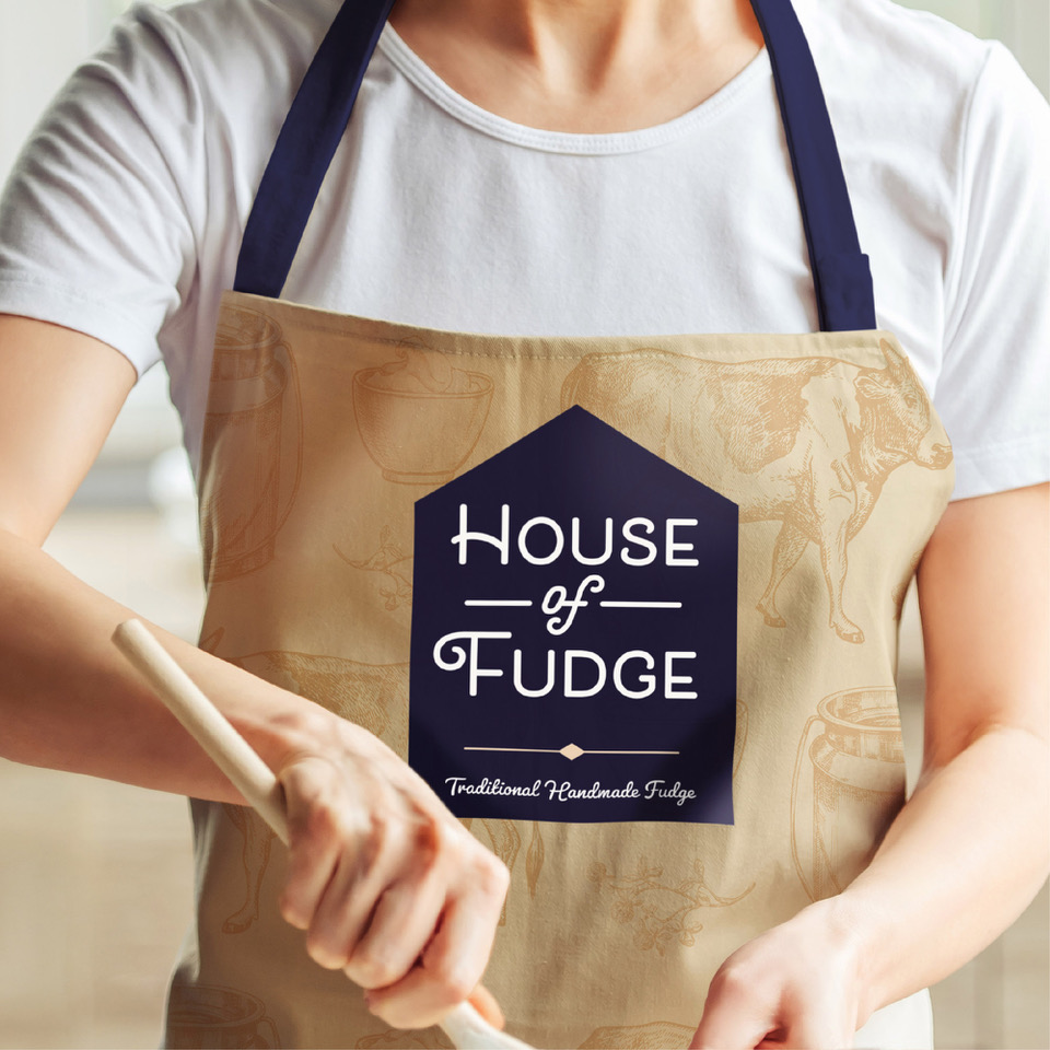
The new brand identity balances tradition and modernity, honouring the brand’s heritage while introducing a cooler, contemporary edge. A bold, house-shaped holding device creates strong consistency across the range and ensures standout and impact on crowded shelves. The background pattern (a key design asset) celebrates the local ingredients that make the fudge so irresistible. A classic colour palette keeps the range easy to navigate, bright and inviting while maintaining the premium cues that define the brand.

