Challenge
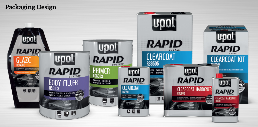
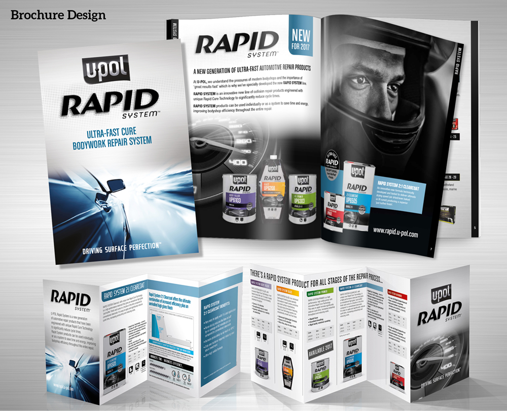
UPOL asked us to create a sub-brand identity and packaging for their breakthrough Rapid System which offers significantly faster curing times versus the competition. As part of the overall U-POL rebranding project, the packs had to look technically superior versus the rest of the portfolio and communicate the key benefits at a glance. We also supported the launch with communication material and collateral.
Solution
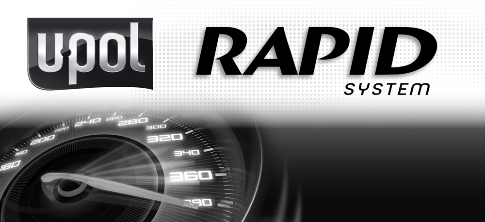
Our metallic silver tins with rich colour coding give technical cues and reflect the premium positioning of the product. The speedometer is a Rapid System asset that is used across all communication material to differentiate the range. We also developed a series of ‘at a glance’ icons to help body shop staff select the correct product for their task.
Result
“The launch of the Rapid System was critically important to the future development of U-POL and the new packaging has been a key factor in its highly successful launch. It met our brief perfectly and really helps to elevate the U-POL brand in terms of quality and innovation credentials. The brochure and other collateral has done a great job in communicating its benefits to the market to build awareness and gain trial.”
Global Category Director, U-POL
